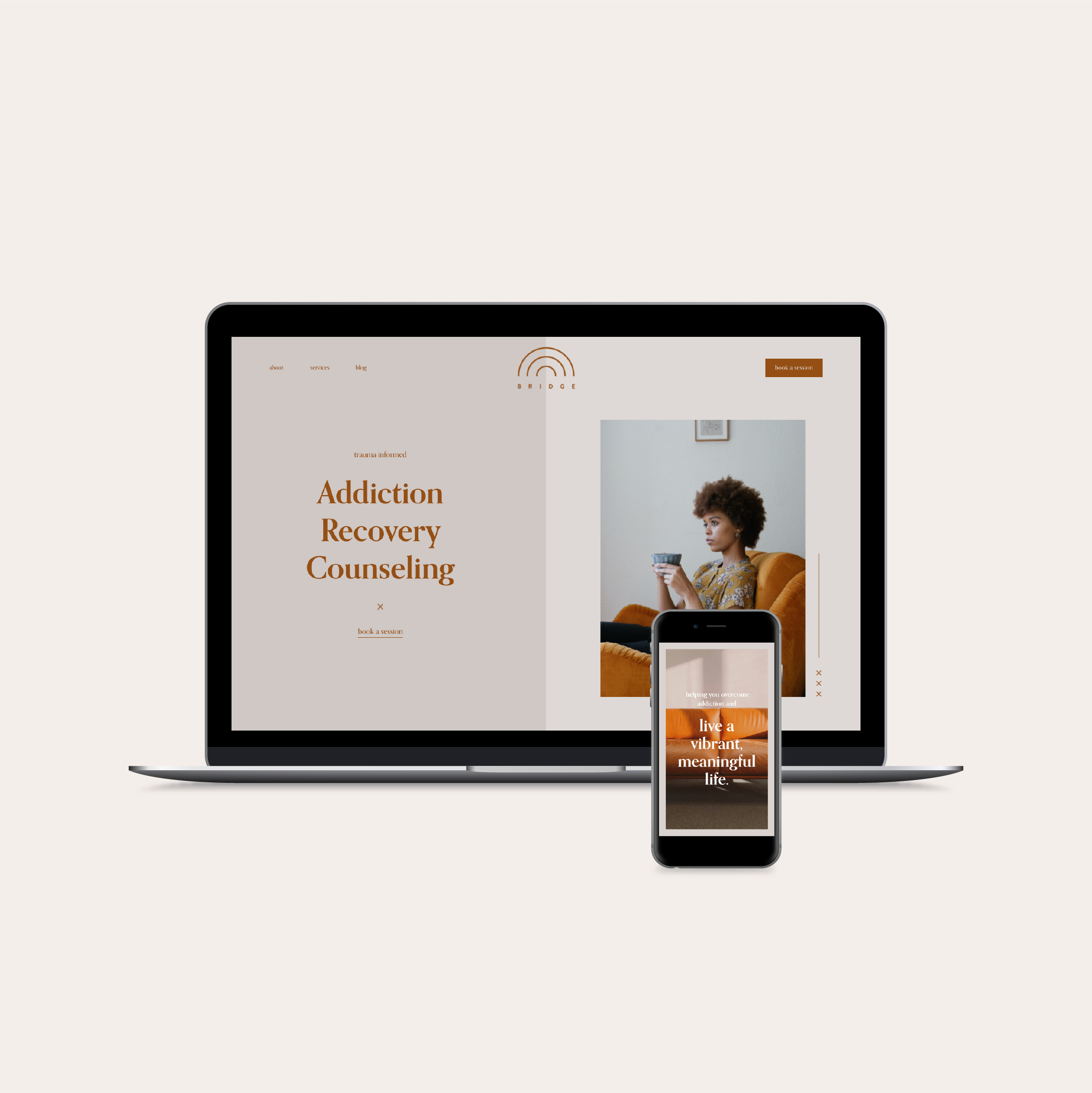
Warm, Welcoming Squarespace Website for a Social Worker
Anna Stern is a Licensed Independent Clinical Social Worker based in Somerville, Massachusetts, and she used the Bridge template to create her therapy website on Squarespace 7.1!
Meet Anna:
Your name, pronouns + credentials: Anna C. Stern (she/her/hers) LICSW
Website URL: https://www.annacstern.com/
Where in the world are you located? Somerville, MA
Bio: Anna Stern is a therapist who seeks new ways to understand human beings, suffering, reclamation, and transformation. She has always been passionate about centering the margins of experience and learning from communities and people operating outside the mainstream. This focus has taken her from organizing for increased access to domestic violence services for people of all genders, abilities, and languages to working with queer and transgender youth, to supporting young people with major mental illness to remain in their communities, to her current private practice. These days, she supports outsiders and change-makers to find their places in the world, to come into alignment with themselves, and to use their own hearts as a compass. Her work is informed by narrative therapy, polyvagal theory, and the neuroaffective relational model (NARM). She is also a mama and partner, who is currently into making soup, reading queer Y.A. dystopian fiction, and watching the leaves change color.
Anna’s prior website experience:
Anna had built websites on Squarespace before, but never quite achieved the aesthetic she was looking for.
Before using the Bridge template, Anna had been using Squarespace for years; she built her own website, helped friends build theirs, and even took web design classes!
“But,” she said, “it’s always been a lot of me Googling and asking questions, and I’d been able to come up with a [final] product I was reasonably happy with… but nothing that compares, aesthetically, to what I was able to make with the Hold Space Creative template.”
Here’s what Anna’s website looked like before using the Bridge template:
Anna found herself in a place that so many therapists and coaches find themselves in: she had a website that was good enough. It was functional, easy to navigate, and had all the necessary info… but she didn’t feel like it represented her true personality.
“Even though I built websites before, even though I know what I’m doing, I just don’t think I could’ve come up with something that was as close to my aesthetic… on my own.”
Results:
Anna stuck closely to the Bridge template’s original design to create a website that feels warm and welcoming. The colors, layout, and design elements portray her style of holding space more accurately than her previous website did.
“I spent over a year waffling about how to upgrade my (self-designed) Squarespace 7.0 site to 7.1, and was able to do it in under a month with this template.”
Using her own professional photos and copy that she had already written, she was able to get her new website up and running quickly.
“Something about having a website that was already designed for me… I was able to take all of these disparate parts that I had been holding onto… and it really felt like I could just seamlessly plug it in.”
Personally, I love how much the Bridge template already fit Anna’s therapeutic style and personality. Without changing much about the original design, the website captures Anna’s warmth, groundedness, and aesthetic style.
One look at the image of her office, and we see earth tones balanced with warm blue and a minimalist vibe that blends seamlessly with the Bridge template’s design.


