Squarespace Font Combinations for Your Personality
If you’re designing a website on Squarespace, you may be overwhelmed with the number of font options, wondering, “How do I choose the right fonts for my website?”
My best tip, whether we’re talking about fonts, colors, or images, is to choose design elements that match your personality and style of holding space.
Because before your visitors read your website, they’re going to take in the visual aspects of your website. Within a fraction of a second, your website’s colors, fonts, images, and design style will convey a personality, whether you’re aware of it or not.
That’s why it’s important to make intentional website design choices for your unique business, rather than copying someone else or following the crowd.
I know it can be really difficult to figure out exactly how to make design choices that align with your personality, which is why I created my free personality quiz. Once you know your personality type, you can start to narrow down your design choices.
In this post, I’m going to share some of my favorite Squarespace font pairings for each personality type. Feel free to use these suggested font combinations on your own Squarespace website, or use them as inspiration to narrow your font search.
*NOTE: fonts marked with an asterisk are available in both Squarespace and Canva.

Squarespace font pairings for The Nurturer personality type


Nurturers are here to care for people. They take a gentle, nurturing approach to therapy or coaching, helping their clients recover and thrive.
Here are three font combinations for Nurturers to use on Squarespace:
Span Thin + Alegreya Sans Light*
This font combination is modern, warm, and friendly. Keep Span at a low font-weight (200 in Squarespace) and Alegreya Sans at a light font-weight (300 in Squarespace). Increasing the font weight on these fonts will communicate more of a Guide personality than Nurturer.
Utile Display Regular + Brandon Grotesque Regular
Utile Display and Brandon Grotesque could also work well for Guides and Sages, depending on the font weight used. Lighter font weights will fit best for Nurturers.
Quattrocento Regular* + Forum Regular*
This font pairing feels like a subtle nod to folk tales and fables, so it would work well for both Nurturers and Sages. Bonus: both fonts are available in both Squarespace and Canva! Keep in mind that Quattrocento looks best when letter spacing is decreased below zero (-0.05em is my preferred letter spacing for this font).
Omnes Pro Light Italic + Omnes Pro Regular
For a minimalist take on the Nurturer personality type, try Omnes Pro on both headings and paragraphs. Using Omnes Pro Light Italic will help your headings feel different (yet complementary) to your paragraphs.
Squarespace font pairings for The Sage personality type


Sages have a wise, calming presence, and they help their clients trust themselves deeply. When working with Sages, people learn to turn inward for guidance.
Here are three font combinations for Sages to use on Squarespace:
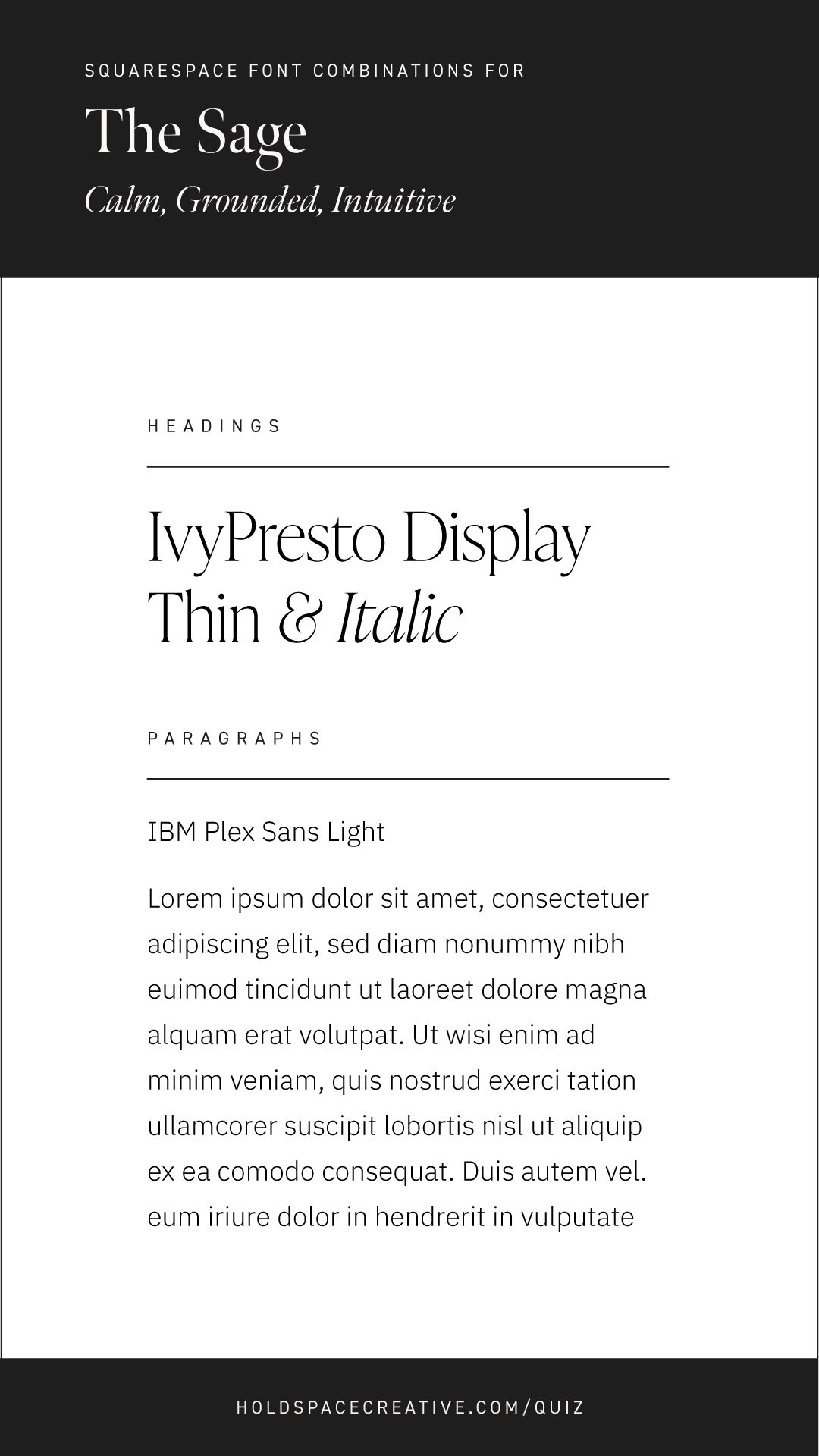
IvyPresto Display Light + IBM Plex Sans Light*
This font pairing is modern and refined, and works well for Sages and Guides. IvyPresto Display looks great in italics and normal style. Stay away from bold/heavy font weights if you’re a Sage.
Baker Signet BT Regular + Muli Light*
This combination is down-to-earth and gentle, and can be seen on the Sage template. Baker Signet BT looks good in all-caps, but for the most “Sage” vibe, normal capitalization is recommended. If you resonate with both Sage and Nurturer personality types, this pairing would work well for you.
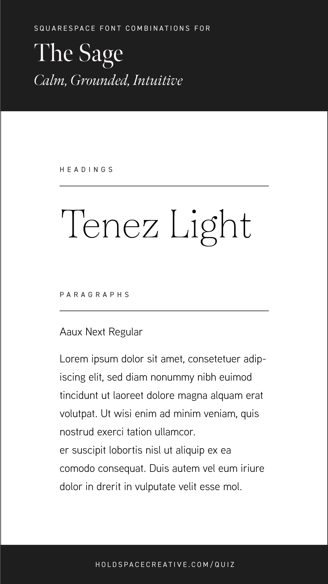
Tenez Light + Aaux Next Regular
For a light and friendly atmosphere, this refined combo does the trick. Keep Tenez at light or regular font weight (300 or 400 in Squarespace) for the most accurate representation of your Sage personality.
Gilda Display Regular* + Alegreya Regular*
For a Sage font combination that can be used in both Squarespace and Canva, Gilda Display and Alegreya is a great pairing. Keep in mind, Gilda Display looks best when letter spacing is decreased below zero (-0.05em is my preferred letter spacing for Gilda Display).
Squarespace font pairings for The Guide personality type


Guides are confident leaders with plenty of expertise to share. They empower their clients with practical tools and knowledge, and their abundance of wisdom helps their clients feel safe and supported.
Here are three font pairings for Guides to use on Squarespace:
Poppins SemiBold* + Stevie Sans Regular
This font pairing is straightforward and energetic. Poppins can be displayed in all font weights and still communicate a Guide personality.
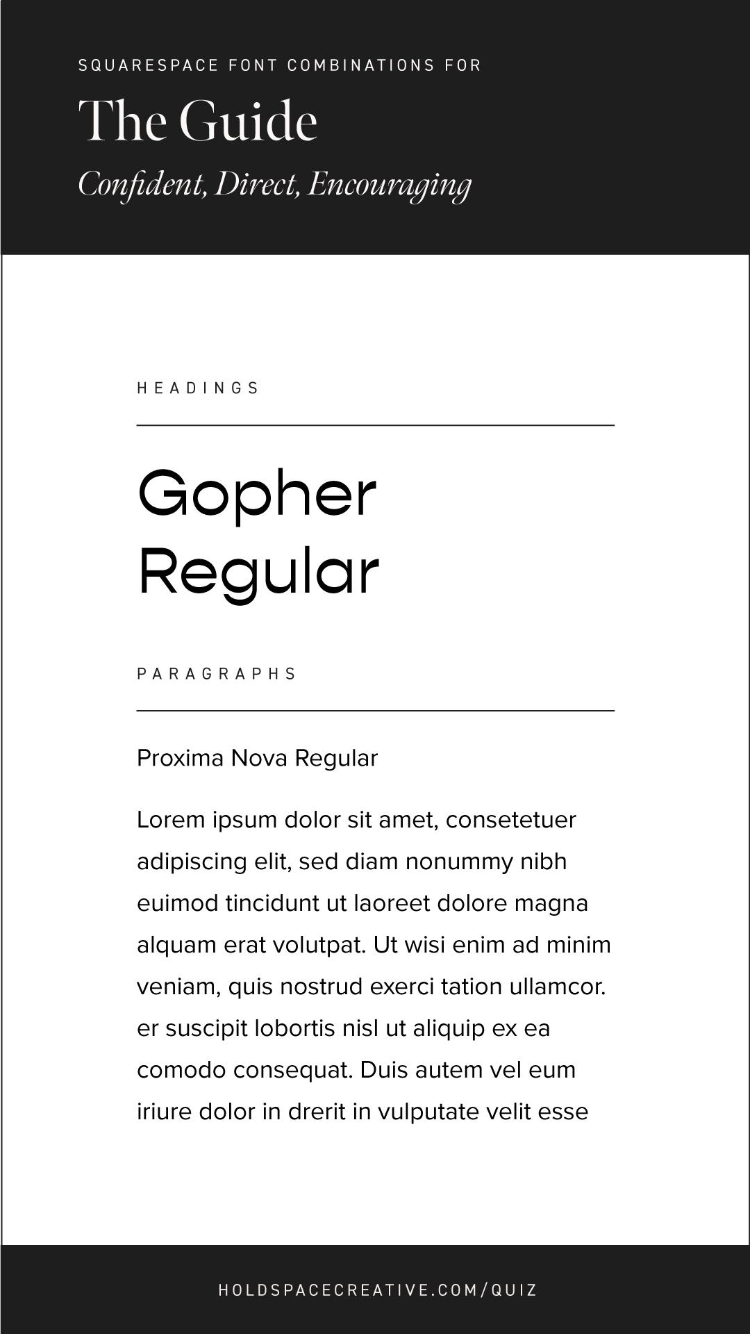
Gopher Regular + Proxima Nova Regular*
This font combination is great for Guides who are looking for a way to showcase their creative or slightly quirky personality. Gopher looks great in all-caps or regular capitalization.
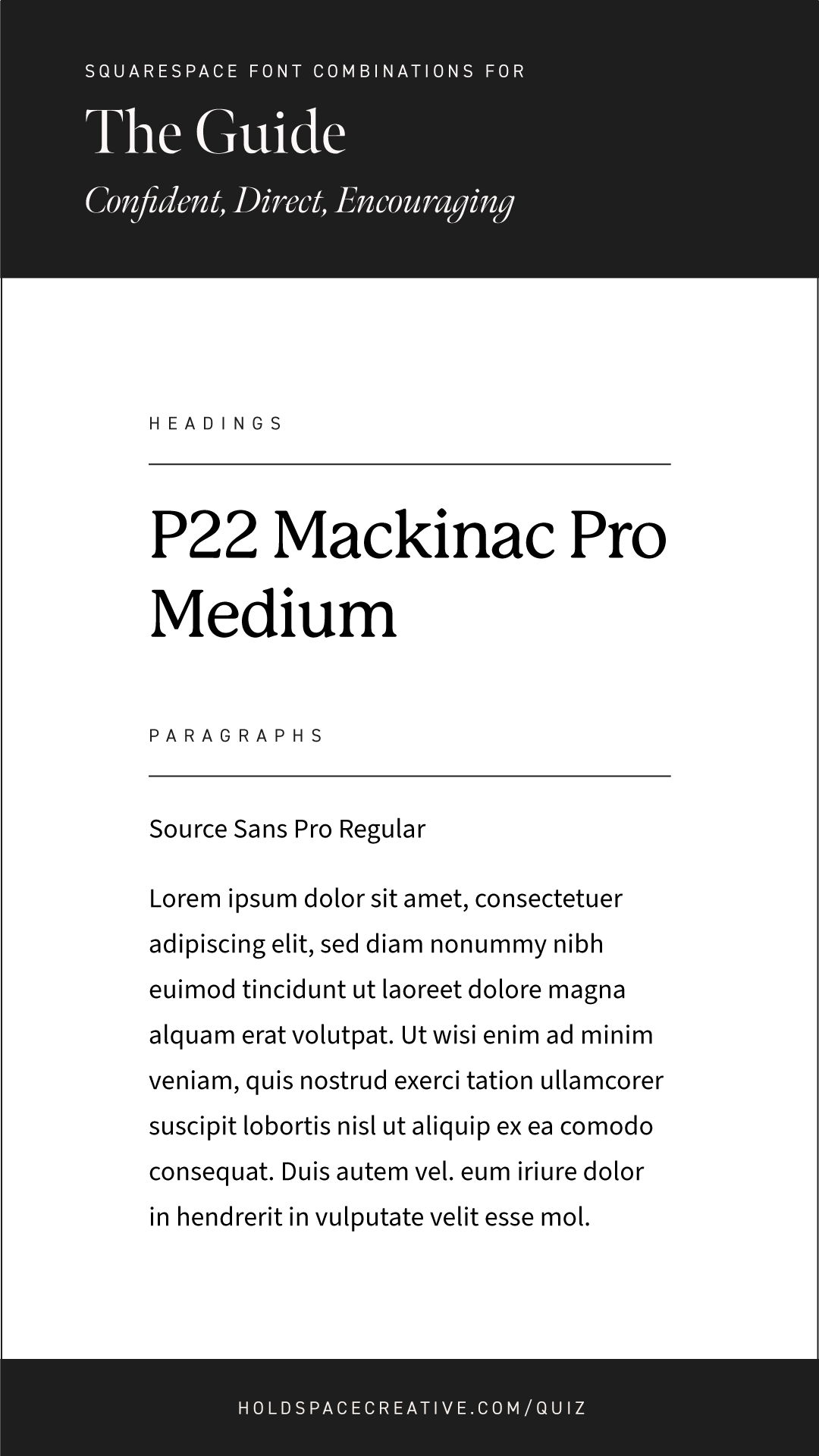
P22 Mackinac Pro Medium + Source Sans Pro Regular*
Together, these fonts are modern and grounded. This combination is perfect for Guides who find themselves resonating with the Sage personality type as well.
Orpheus Pro Bold + Freight Sans Pro Book
These fonts communicate a friendly, down-to-earth personality. Guides should make sure their fonts don’t communicate a delicate style, so light/thin font weights aren’t recommended. Orpheus Pro Bold can be seen on the Bridge template.
Squarespace font pairings for The Visionary personality type


People with a Visionary personality are true cheerleaders and advocates at heart. They always have their clients' highest potential in mind. They take a creative approach to their work, and they're not afraid to be bold.
Here are three Squarespace font pairings for Visionaries:
New Spirit Bold + IBM Plex Mono Regular*
This font pairing communicates a bright, bold personality. I recommend using normal capitalization for Quincy to showcase it’s softness.
Termina Medium + PT Mono Regular
This font combo is modern and edgy. I recommend using all-caps for Termina Medium, which can be seen on the Sol template.
IvyPresto Display Bold + Omnes Pro Medium
For the Visionary who also has Sage personality traits, this font combo brings creativity, boldness, and refinement.
Swear Display Cilati Medium + Purista Pro Medium
A bold, unique font pairing that communicates creativity and friendliness. Swear Display Cilati looks great in large sizes.
Squarespace font pairings for The Mystic personality type


Ones to embrace the unseen forces that influence change and growth, Mystics help their clients feel connected to something greater. They're not afraid to go deep, and they take a creative approach to their work.
Here are three Squarespace font pairings for Mystics:
Brandon Grotesque Bold + Futura PT Book*
These modern and friendly fonts work well for people who have both Mystic and Guide personality traits. Brandon Grotesque looks great in all-caps, and for Mystics: the bolder the better.
Ohno Blazeface + Degular Regular
This font pairing is great for folks who embody both Mystic and Visionary personality types. Ohno Blazeface brings an energetic, creative style, while Degular’s straightforward sans-serif style provides grounding.
New Spirit Bold + Averia Serif Libre Light
The soft edges of these fonts lend well to Mystics’ flowing, intuitive approach to their work.
Livory Regular / Italic + Calluna Sans Regular
For the Mystics who lean toward a gentle, Nurturer style, this font combination communicates a soft, poetic personality.
Pro Tips:
Regardless of the font pairing you end up using on your Squarespace website, keep the following in mind:
Don’t use too many different fonts on your website. Using too many different fonts on your website not only has the potential to overwhelm your visitors but can also slow down your website. One heading font and one paragraph font usually does the trick!
Use the same fonts across all online platforms. Whichever fonts you use on your website, use the same ones to create social media graphics.
Don’t forget about letter spacing. Some fonts look better with a little space between each letter - some look worse. Play around with it and ask for opinions from others if you need help!
For more font “do’s” and “don’ts”, read this post.