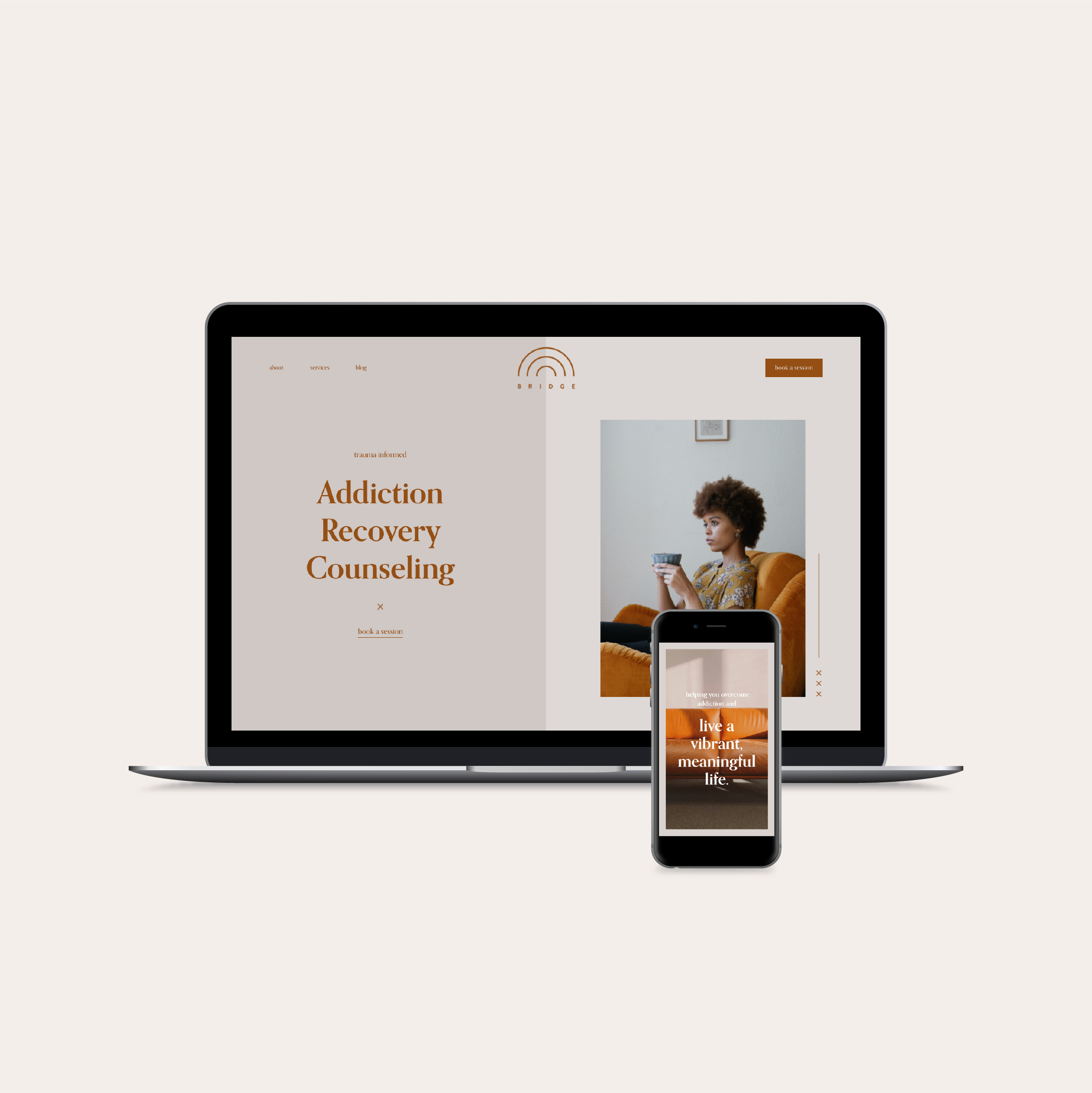
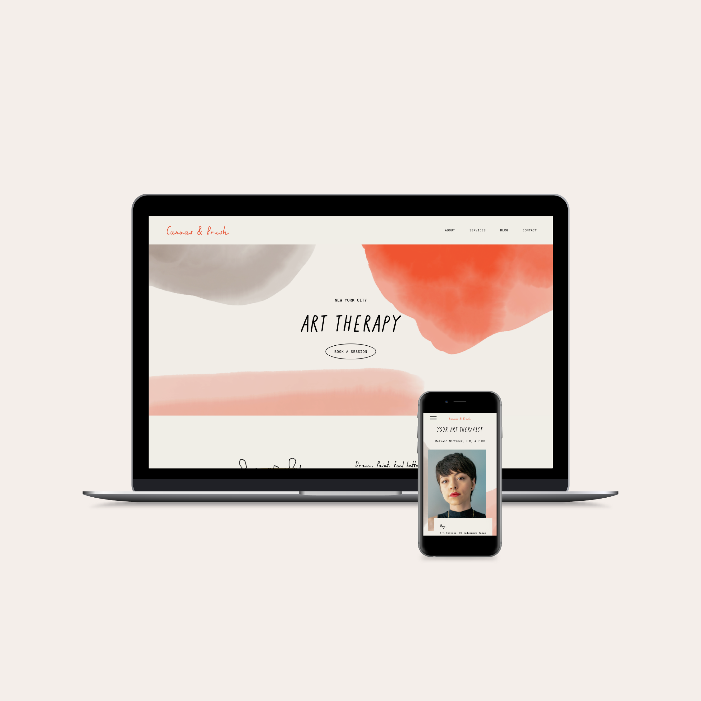
5 Types of Photos You Need On Your Therapy Website
When it’s time to create a therapy website, most therapists wonder where to find good stock photos. Finding photos that showcase your personality and therapeutic style is no small feat, so in this post, I’m going to share the five types of photos I recommend having on your therapy (or coaching) website.
However, before you start sourcing photos for your website, read this post. In it, I talk about the things you need to do before selecting photos and whether to use stock photography or hire a professional.
Spoiler alert: I always recommend hiring a professional photographer rather than using stock photography for a business website.
Stock photography can feel impersonal, generic, and detached, while custom photography feels personal, relatable, and unique (all things that you’ll need in order to stand out and attract your best-fit clients).
When designing your therapy website or coaching website, include the following types of branding photos for a well-rounded, professional website that showcases your personality and stands out from the crowd:
1. Headshots
A headshot is one of the most important images you'll need on your website because it features you! The people visiting your website are trying to understand what it feels like to work with you, and seeing a picture of you helps them do that.
You probably have at least one headshot that you use for directory listings, your LinkedIn profile, etc., but I encourage you to use several different headshots across your website.
Using multiple pictures of you will help potential clients get a more well-rounded sense of you and your personality, which will help them feel more comfortable in reaching out.
I know it might feel uncomfortable to include several pictures of yourself on your website, but I promise, it won’t come off as self-centered or egotistical. In fact, therapy-seekers consistently report that they want to see more pictures of therapists on their websites.
A great example of a therapy website that uses multiple headshots is Cypher Mental Health. Owner, CéShaun Hankins, LCSW, worked with a photographer to take a set of headshots so that she had a different one to use on every main page of her website. We love to see it!
How to take great headshots for your therapy website
Wear clothes you would wear in client sessions that you feel great in.
Work with a photographer you feel comfortable with.
Don’t worry about what a headshot “should” look like; focus on being yourself.
Show up as you are now. You don’t need to lose weight, have perfect teeth, or have a whole new wardrobe to take great headshots.
2. Candid shots
Candid shots are the best type of photo to use on your website. They show who you really are as a therapist and give visitors an idea of what kind of therapy you provide.
Candid shots are pictures of you where you’re not looking directly at the camera and smiling (like a headshot). These could be photos of you sitting on your therapist's chair, typing on your computer, walking through your favorite park, or doing an activity that you like to do with your clients.
As someone who’s designed hundreds of counseling websites and coaching websites, I can say that trying to design a website with headshots alone is pretty challenging. It’s nice to have a variety of photos to choose from that give your visitors a sense of who you are.
For example, Lauren Cañafranca, owner of Elbie Coaching, used a mixture of headshots and candid shots on each page of her website, resulting in a website that feels really personable and approachable:
How to take great candid shots
Have your photos taken in your office (if you don’t have a physical office, imagine for a second that you do. Choose a location that matches the vibe of this imaginary space.).
Bring some materials or activities that you commonly do with clients to your photoshoot (art materials if you’re an art therapist, toys if you’re a play therapist, etc.)
Wear clothes you would wear in client sessions that you feel great in.
Work with a photographer you feel comfortable with.
3. Pictures of your office space
A picture is worth a thousand words, so make sure you have some good images of your office space on your website. It will help people understand how professional your practice is and also give them a sense of comfort when visiting your site.
As someone with anxiety, I really appreciate it when businesses feature photos of their office, building, etc. on their website so that I know what to expect and look for when I arrive for the first time.
This is why relying on stock photos doesn’t quite cut it. When you see clients in-person, but don’t show your actual space on your website, potential clients will either:
Hesitate to reach out because they don’t know what to expect, or…
They’ll show up expecting your space to look like the stock photos, only to be confused and potentially distrustful when your actual space doesn’t match the pictures.
A great example of a counseling website that uses pictures of their office space is Rocca Family Therapy & Counselling. Lise McMillan, LMFT used pictures of her office throughout her website to help visitors imagine themselves in her space.
How to take great pictures of your office space
Have your pictures taken in the daytime.
Use natural light or lamps (limit use of overhead fluorescent lighting in your photos if you can).
Clean and declutter your space beforehand.
What if I don’t have a physical office space?
If you exclusively see clients virtually, and you don’t have a physical office space, choose a location for your photoshoot that exemplifies your dream office space.
Imagine for a second that you do see clients in person. What type of space would you dream of working in? How would you decorate it? Find a location near you that matches your vision. Your photographer may be able to help you find a location if you share your answers to these questions with them.
4. Close-up details
Ask your photographer to take some detail shots as they’re taking photos of your office (or mock office). You put time and intention into every detail of your space, so why not showcase these details on your website?
Detail shots help visitors feel “up close and personal” with you and your practice. When you show these details, visitors can interpret and infer meaning, providing even more context around who you are and what your work is all about.
Whether you see clients in-person or virtually, have your photographer take pictures of small details that are important to you. This could be books on your bookshelf, wall decor, plants, items on your desk, etc.
Close-up detail shots could also include parts of you! For example, your hands writing in a journal, using art materials, or playing with toys. Again, make sure whatever you’re doing in the photos is relevant to your practice.
Dr. Ann Krajewski (PsyD) used some great close-up detail shots throughout her website:
How to take great close-up detail shots
Gather props that are relevant to your practice beforehand & bring them to your photoshoot.
Communicate to your photographer that you’d like this type of photo taken.
Ask your photographer to take several detail shots from several different angles so that you have plenty to choose from for your website.
5. Textural / abstract shots
One of the most underrated, yet the most versatile type of photo for your website is the textural or abstract shot. This type of photo typically doesn’t have people in it and very few objects (if any).
Here are some examples:
Textural or abstract shots can easily be used as backgrounds without distracting from the text on the page, and if they’re taken by your brand photographer, they’ll have the same colors and tone of your other photos so they’ll be sure to match your overall site design.
Plus, these types of photos are more emotionally evocative than photos of you or your space. And since therapy websites work best when they can connect with visitors on an emotional level, textural or abstract photos are really the key to elevating your therapy website design.
Here are some examples of textural / abstract photos, as seen on my Squarespace templates for therapists and coaches:
How to take great textural or abstract shots
Communicate to your photographer that you’d like this type of photo taken.
Identify your brand colors and have your photographer take textural or abstract shots that contain these colors.
Items photographed with a soft focus can create an abstract shot.
Blank walls, shadows, fabric, foliage, and textiles make great textural shots for therapy websites.
A note on stock photography:
While it’s possible to design a unique and professional website using royalty-free stock photos, it often takes the time and expertise of a skilled designer to source the right photos.
That’s why, even though it doesn’t seem like the easier option, booking a brand photographer will save you so much time and energy. Not to mention, custom photos will instantly make your website feel more authentic and approachable.
Pro-tip: Use this article as a guide as you plan your brand photoshoot with your photographer.
Photographers appreciate clear communication, so letting them know what types of photos you need beforehand will help the photo shoot go smoothly and ensure that you walk away with the photos that you need.
Find my shortlist of brand photographers here, or Google “brand photographer” to find a photographer who can take therapist branding photos in your area.


"Veritas" was designed for therapists and counselors who want to break away from the soft, pastel aesthetics of typical mental health websites. This website features a sophisticated black-and-white palette with warm brown accents and editorial-inspired layouts to create an intellectual, grounded atmosphere. Learn more →
View the Demo